Client Area Layout
The Client Area can display in two layouts, Desktop Mode or Responsive Mode.
Desktop Mode
Desktop Mode typically appears in desktop web browsers.
Homepage Panels in Desktop Mode
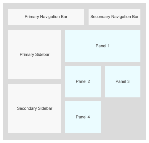
Desktop Mode renders most Client Area homepage panels in two columns.
For single-column panels, odd-numbered panels appear in the left column and even-numbered panels appear in the right column.
Panels that span both columns will render above the two-column layout, separately from the array of panels. Because of this, if a two-column panel is present, a single-column even-numbered panel can become an odd-numbered panel.
Navigation Bars and Sidebars in Desktop Mode
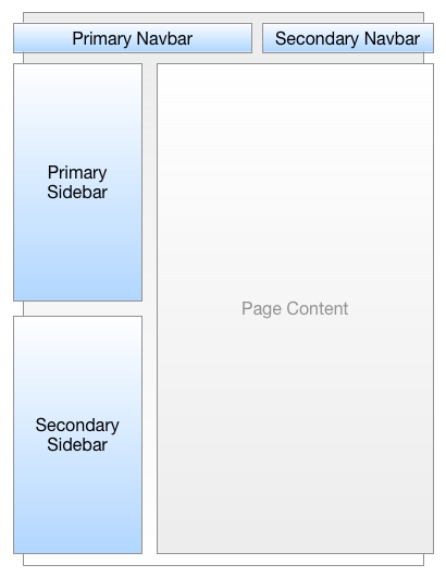
There are two navigation bars in the Client Area:
- The primary navigation bar contains the bulk of the menu and floats to the left of the secondary navigation bar.
- The secondary navigation bar contains user-specific items and changes if a client is logged in to WHMCS.
There are two sidebars on every Client Area page.
- The primary sidebar appears above the secondary sidebar on the left side of the page.
- Sidebar content varies per page, though the primary sidebar typically displays information directly relevant to the page content while the secondary sidebar usually contains more general links.
Responsive Mode
Responsive Mode activates when the Client Area renders on a smaller screen like a phone or tablet. It renders all panels in a single column.
WHMCS rearranges the page layout in responsive mode for the best display on that device.
Homepage Panels in Responsive Mode
In Responsive Mode, the Client Area renders all panels in a single column.
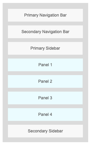
All odd-numbered panels (left in Desktop Mode) display above all even-numbered panels (right in Desktop Mode).
Navigation Bars and Sidebars in Responsive Mode
Responsive mode activates when a visitor views the Client Area on a smaller screen, like a phone or tablet.
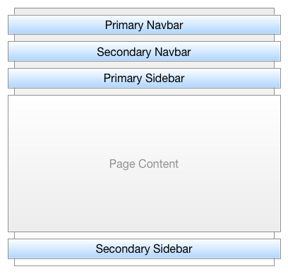
In responsive mode, the primary and secondary navigation bars appear above the primary sidebar. Under this, the page’s content displays, with the secondary sidebar at the bottom of the page.
Last modified: 2025 November 27